Same words, same message, a page with far more presence.
- Role
- Web designer and Elementor developer
- Scope
- Redesign of an existing landing page, desktop and mobile
- Built with
- Elementor Pro, no custom CSS
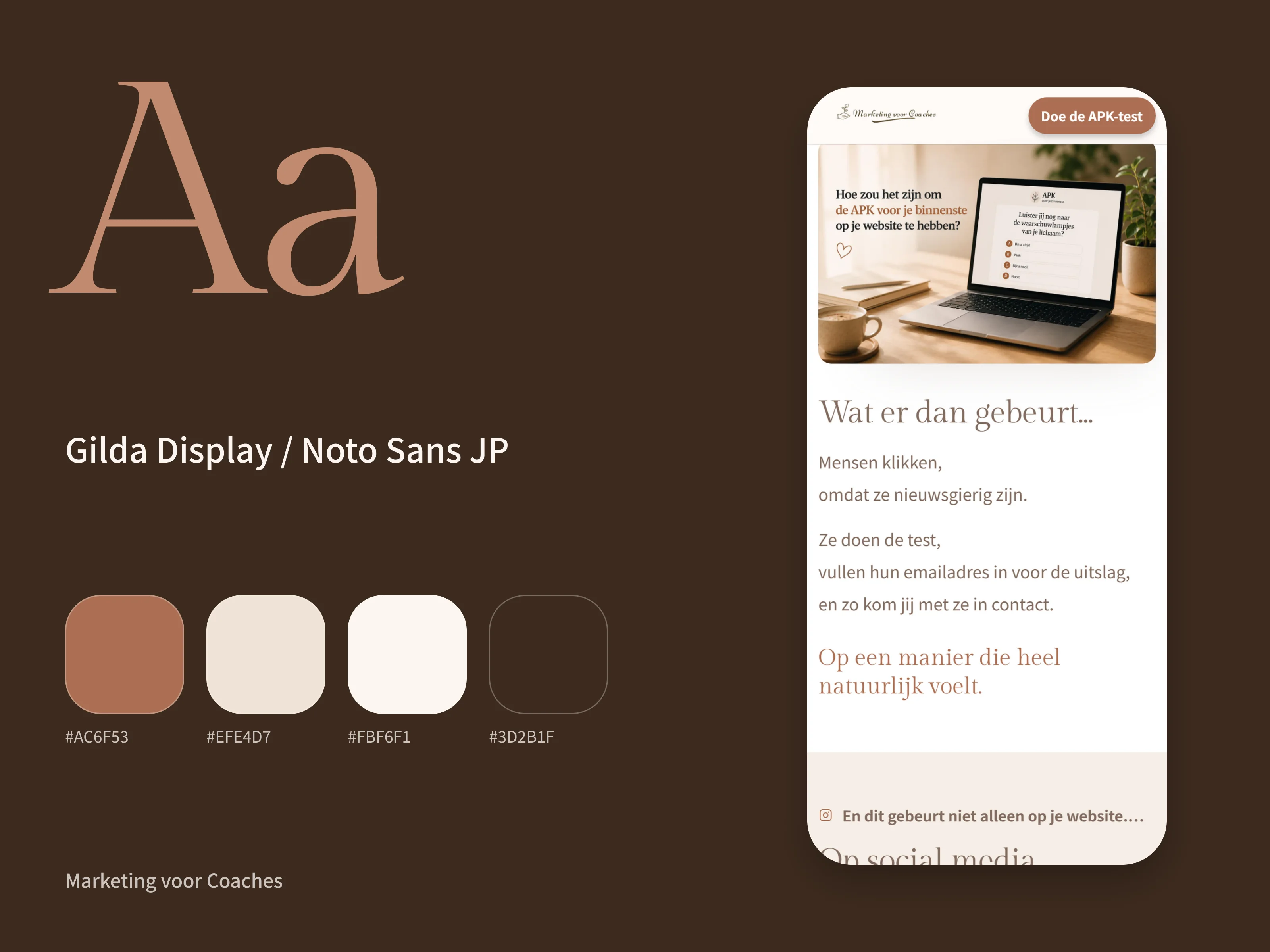
- The project’s own system
- Gilda Display and Noto Sans JP, soft corners
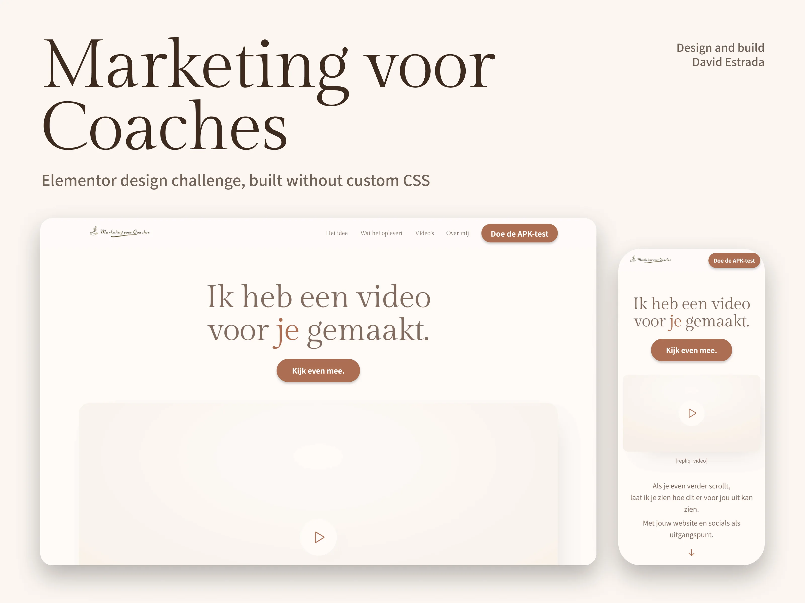
The brief
Marketing voor Coaches is a coaching-marketing business in the Netherlands. Its owner already had a landing page that worked, and she set an Elementor Design Challenge on Upwork: several designers, the same page, to see what a fresh pair of eyes would do with it before she settled on a final version.
The rules were tight. Not a word of the copy or the marketing message could change. The page had to feel calm, warm and professional, never salesy. And it had to be fully compatible with Elementor, with no custom CSS at all.
So this was a pure design problem: same words, same offer, and the only tools were hierarchy, typography, spacing, images and motion.
What I did
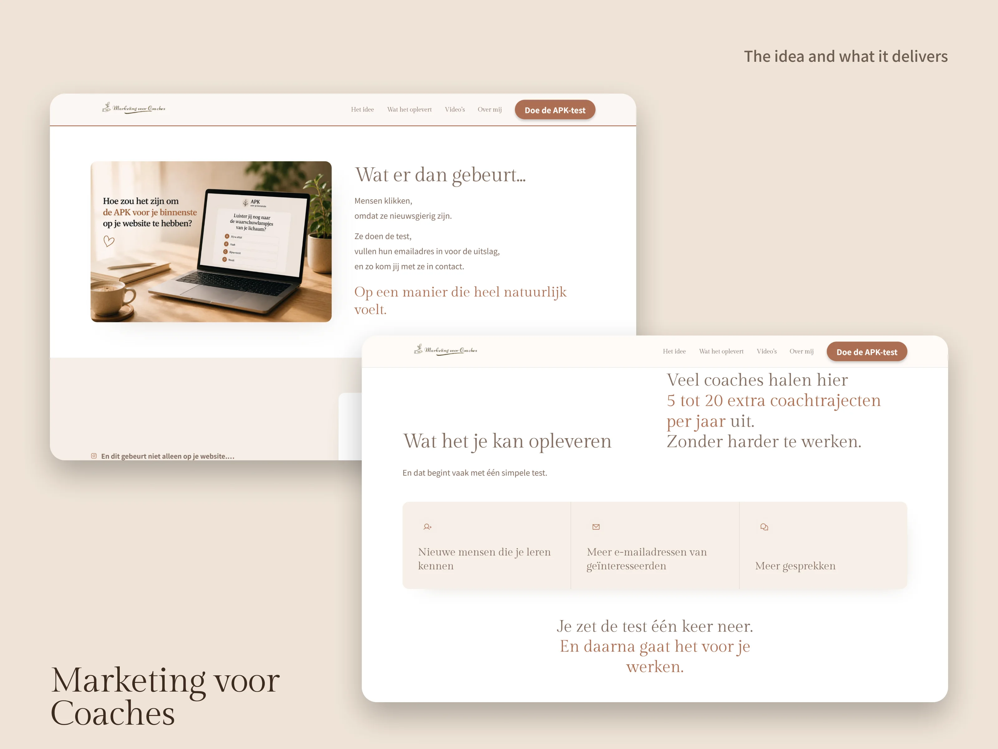
- A new typographic hierarchy: an editorial serif for headlines and a clean sans-serif for body text, so the most important messages on the page carry real visual weight instead of all reading at the same volume.
- A new scroll narrative: a personal introduction, alternating image and text blocks, quotes used as moments of emphasis, and a clear close with the call to action. The rhythm changes as you go down the page, which is what keeps people scrolling.
- Calm instead of urgency. No countdown timers, no pop-ups, no capital letters shouting discounts; the page persuades by being clear.
- Consistent hover states and small interactions on buttons, cards and images, all made with Elementor’s own settings.
- One colour and spacing system matched to her main website, so moving from one to the other feels like a single brand, and set up as reusable Elementor variables for future pages.
- A design planned from the first sketch to be built with Elementor’s native controls: containers, variables and native hover states. I prototyped the page first and then rebuilt it in Elementor section by section, with zero custom CSS.
- A complete responsive version, checked on desktop and mobile, that keeps the hierarchy and stays easy to read on a phone.
The result
She gave the work five stars and told me she would carry several of the ideas into the final version of her page: how to give key messages more emphasis, how to highlight results, and how to vary the rhythm as someone scrolls.
“David participated in my Elementor Design Challenge and created a design with a strong visual personality. I particularly liked his use of typography, contrast and out of the box ideas.”