A new kind of sponsorship, explained in one page, and delivered in two colours to choose from.
- Role
- Product designer and Figma web designer
- Scope
- Landing page for desktop and mobile, two colour directions
- Built with
- Figma
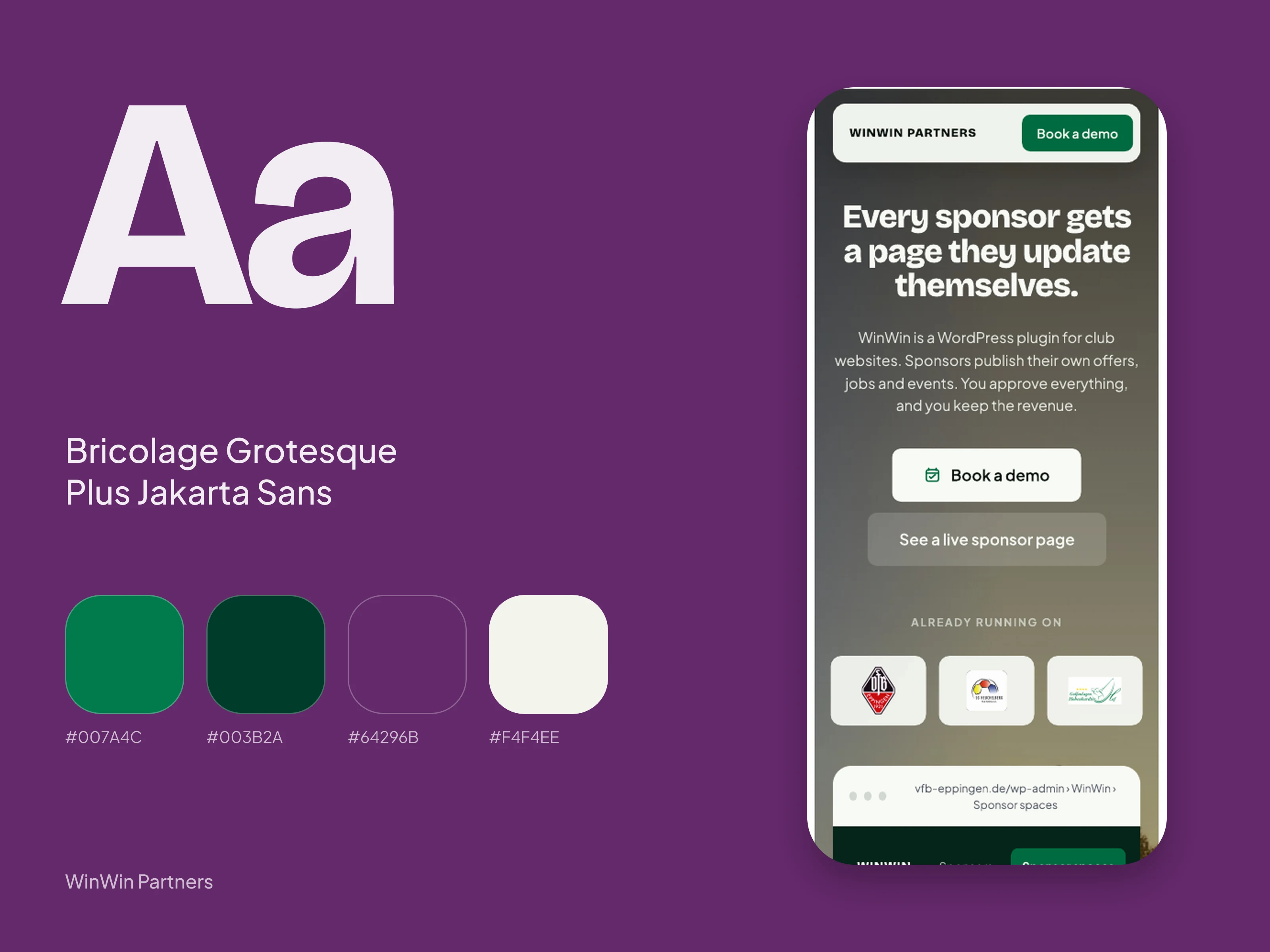
- The project’s own system
- Bricolage Grotesque and Plus Jakarta Sans, round panels
The brief
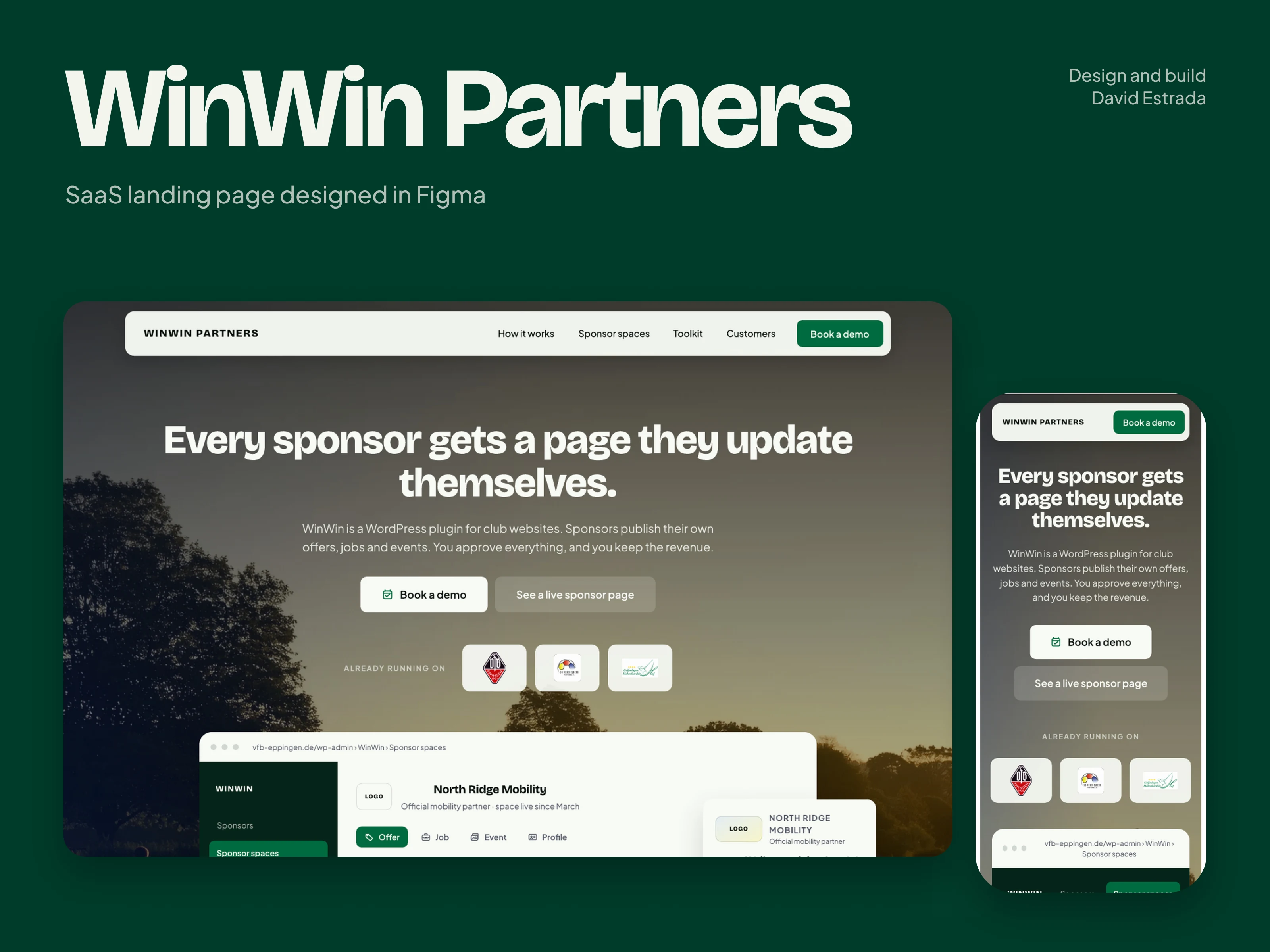
WinWin Partners helps sports clubs turn static sponsor logos into useful sponsor spaces: sponsors publish offers, jobs, news and company information, while the club stays in control and the content stays inside the club’s own site.
The landing page had to explain an unfamiliar sponsorship model quickly, show enough of the real interface to be believed, and still carry the energy of local sport rather than looking like one more software page.
It also needed complete desktop and mobile layouts in Figma, not a single desktop composition with the phone left for later.
What I did
- Built the story around the product’s central idea: a static sponsor logo becomes an active sponsor space. Everything on the page leads back to that one change.
- Combined readable interface evidence, so a visitor can see what the product actually looks like, with editorial sports photography that gives the page its feeling.
- Designed high-fidelity layouts for desktop and mobile, section by section.
- Structured the page in the order a club would ask its questions: what sponsors get, how the club keeps control, the three-step process, what the product can do, who already trusts it, and a final call to book a demo.
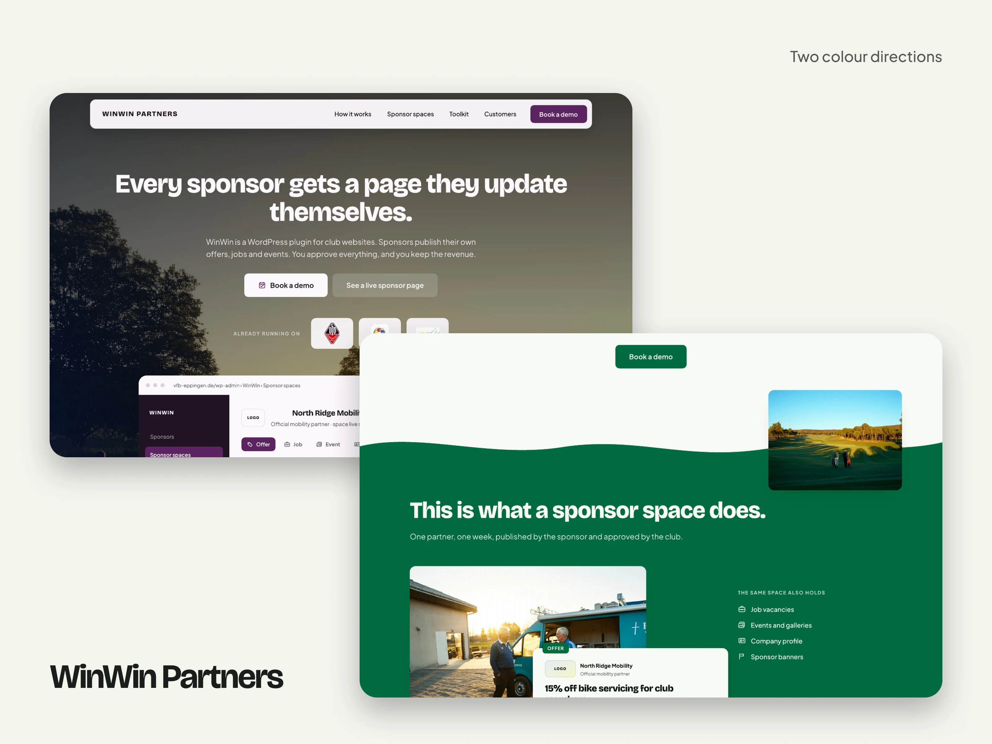
- Produced two complete colour directions, green and purple, so the team could compare them side by side before refining the final one, instead of imagining a second option from a description.
The result
The client approved the design with a five-star review, and singled out both the quality of the design and being able to compare colour options. The delivery was the Figma design; no launch or conversion figures were shared with me.
“Excellent design and multiple colour options to choose from and compare.”